
AdvisorHub | Design System
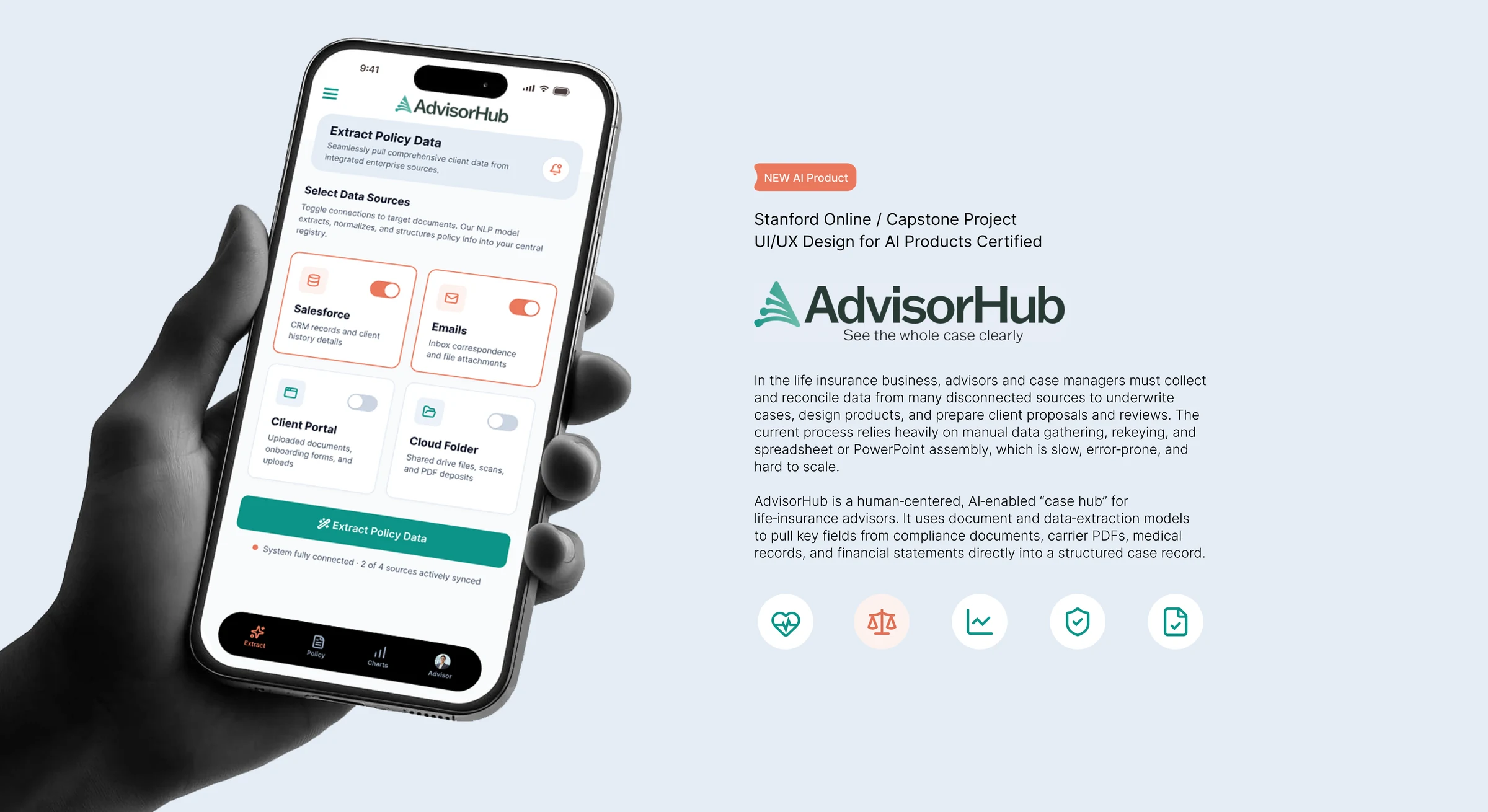
AdvisorHub is a transparent AI case workspace for life insurance advisors and case teams. It brings data, documents, illustrations and tasks from scattered systems into one reviewable view and shows its sources rather than hiding them.
Principles
Source-Connected Case View
CRM, email, cloud storage, carrier portals, documents and illustrations, brought together.
Inspectable Intelligence
Sources, rationale, confidence, changes and human edits stay visible.
Progress Visibility
Status, missing requirements, upcoming reviews and next actions are on the surface.
Content Fundamentals
Voice
Declarative and specific. AdvisorHub reports state. It does not cheer, promise or hedge.
Person
Imperative for actions, never “we”. The interface addresses the advisor directly.
Casing
Title Case for screens and cards, sentence case for descriptions, UPPERCASE for record labels.
Naming
Real system names, filenames and values, shown verbatim, because traceability is the product.
Dates and numbers
Absolute dates, currency with cents, counts as fractions: “2 of 4 sources”.
Status copy
A subject, a middot and a count: “Online · Ready to analyze”.
Write and Avoid
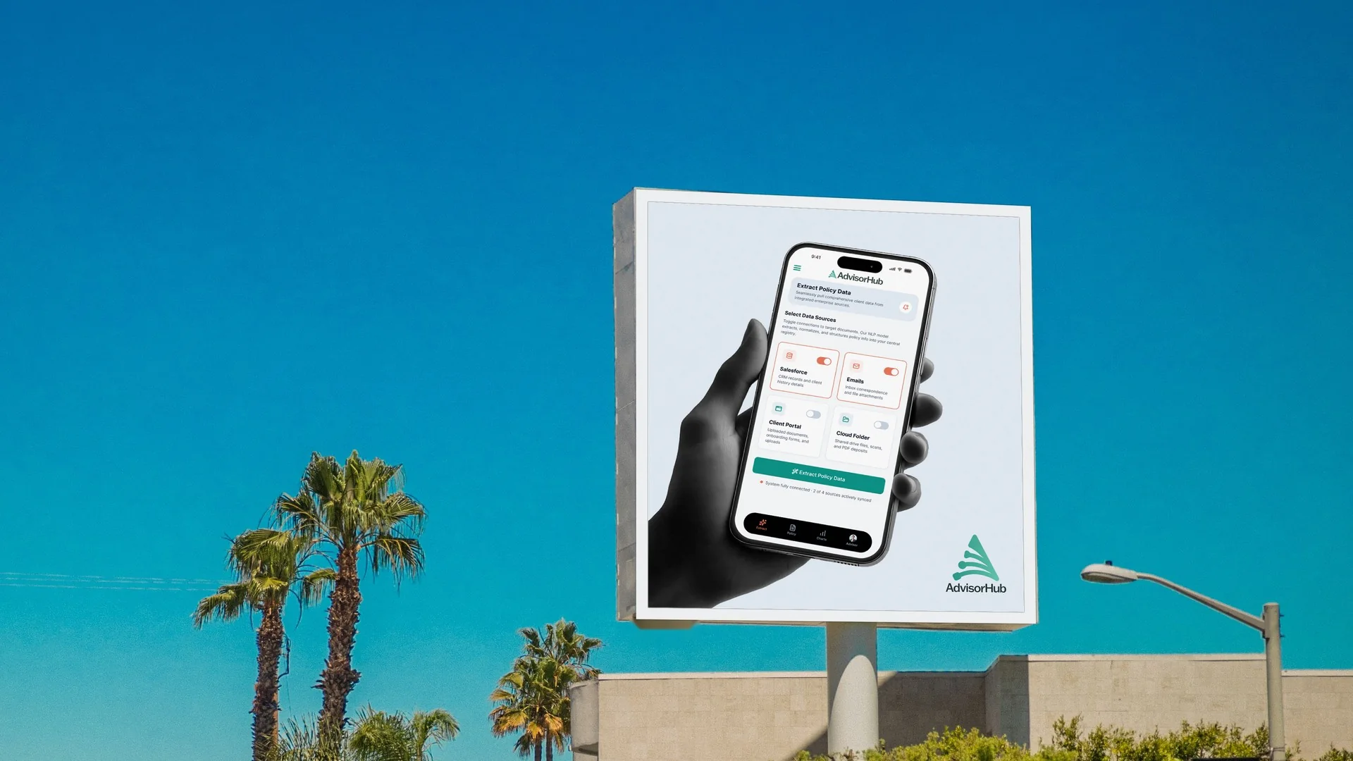
“System fully connected · 2 of 4 sources actively synced”
“Centralized profile view of structured policy records.”
“Online · Ready to analyze”
“You’re all set!” and exclamation marks
“Magically understands your case”
“2 days ago” (case records use absolute dates)
In This System
Visual Identity
Logomarks, color, typography, imagery and the landing page.
Motion
The product prototype, logo animation, storyboard and loading graphic.
Components
Tokens for color, spacing, shadows, type and easing, plus the UI components.
Visual Identity


Primary Logomark


Secondary Logomark


Color
Forest carries the wordmark and dark fields. Teal is the primary action. Coral is attention only—live, flagged, active. Neutrals are cool and blue-cast.
Typography
Primary and Secondaryabcdefghijklmnopqrstuvwxyz
0123456789 $ % · —
abcdefghijklmnopqrstuvwxyz
0123456789 $ % · —
Imagery






Landing Page
Product Prototype
Logo Animation
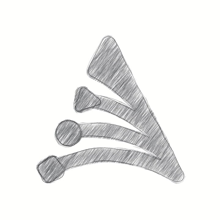
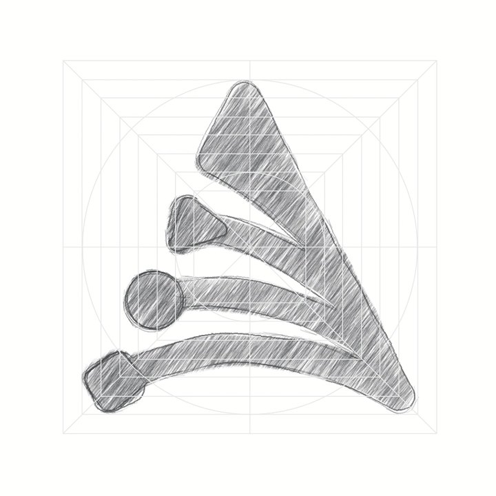
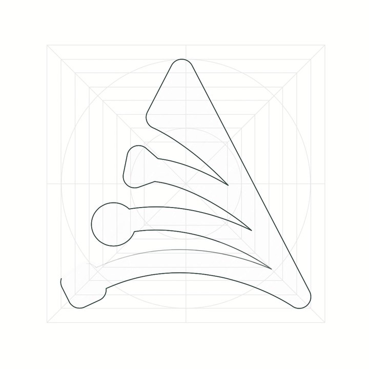
A 24.4 second seamless loop. The pencil sketch becomes a grid and an outline, then a dark gradient fill sweeps the mark. The wordmark draws in letter by letter, light blue, coral and green fields pop in behind the lockup, and the tagline fades in before the logo turns green and swipes out to white.
Animation Storyboard










Loading Graphic

The logo mark swipes in left to right in the brand gradient, holds, then swipes out to the right on a 2.6 second loop.
Color Tokens
Brand swatches carry identity, derived tints, shades carry state, and cool blue-cast neutral ramp carries text, surfaces and borders.
Spacing
A 4px grid. 20px screen gutter, 12px between cards, 24px between sections, 16px card padding.
Radius
Shadows
Font Weight
Font Size
Line Weight
Line Height
Letter Spacing
Scale
Icons step from 19px in attachment rows to 24px in banners. Controls press to 98%, hold the darker fill. Nothing grows on hover.
Easing and Duration
Calm, short and flat. Nothing bounces or overshoots: 120ms hover tints, 180ms toggles and tabs, 280ms screen transitions.
Components
Live React components from the AdvisorHub library. Cards separate with a 1px cool border first and a whisper of shadow second. The one loud state is active, a 1.5px coral outline.